

Schlitz Beer Hat- Distressed Black Snapback
$ 35.00
Schlitz Beer Baseball Cap
Go for the gusto with the Schlitz Beer Hat—a distressed black snapback that celebrates iconic American brewing heritage and vintage beer culture. Perfect for Schlitz fans, beer historians, and anyone who appreciates classic brewery tradition. This hat features the legendary Schlitz branding that honors generations of quality beer and timeless American spirit. Crafted from ultra-soft, breathable fabric with an adjustable snapback closure, it delivers all-day comfort that keeps you coming back for more. The weathered distressed finish captures authentic vintage character and that perfectly worn-in aesthetic that only genuine retro pieces possess. Whether you're a beer enthusiast, a vintage collector, or simply someone who loves classic American breweries, this hat lets your passion for Schlitz and retro beer culture shine through with attitude. Grab yours and join the legacy of Schlitz devotees who refuse to settle for anything less than legendary.
Hats and tees featuring this iconic logo are now available on our Angry Minnow Vintage site (All items sold separately). Schlitz Beer Apparel
Schlitz Beer Baseball Cap
Officially Licensed by Pabst Brewing Company! Schlitz Beer hat Angry Minnow Vintage. Schlitz Beer Baseball Cap
Adjustable snap-back closure, low profile, soft and comfy fit like a favorite baseball hat.
Fits up to size 7 1/2"


Rainier Beer Hat- Distressed Black Snapback
$ 35.00
Rainier Beer Hat Retro Hat
Reach for the peaks with the Rainier Beer Hat—a distressed black snapback that celebrates Pacific Northwest brewing heritage and vintage beer culture. Perfect for Rainier fans, beer enthusiasts, and anyone who loves authentic regional brewery tradition. This hat features the iconic Rainier branding that honors generations of quality beer and timeless mountain spirit. Built from incredibly soft, breathable fabric with an adjustable snapback closure, it delivers comfort that keeps you reaching for it again and again. The weathered distressed finish captures authentic vintage character and that perfectly worn-in aesthetic that only genuine retro pieces possess. Whether you're a beer collector, a Pacific Northwest native, or simply passionate about legendary American breweries, this hat lets your love of Rainier and retro beer culture shine through with style. Grab yours and join the community of fans who know that the best views come with a cold Rainier and the perfect vintage hat.
Prepare to hear "Where did you get that!"
Adjustable Snapback, super soft low profile hat. Fits like your favorite hat!
Fits up to size 7 1/2"
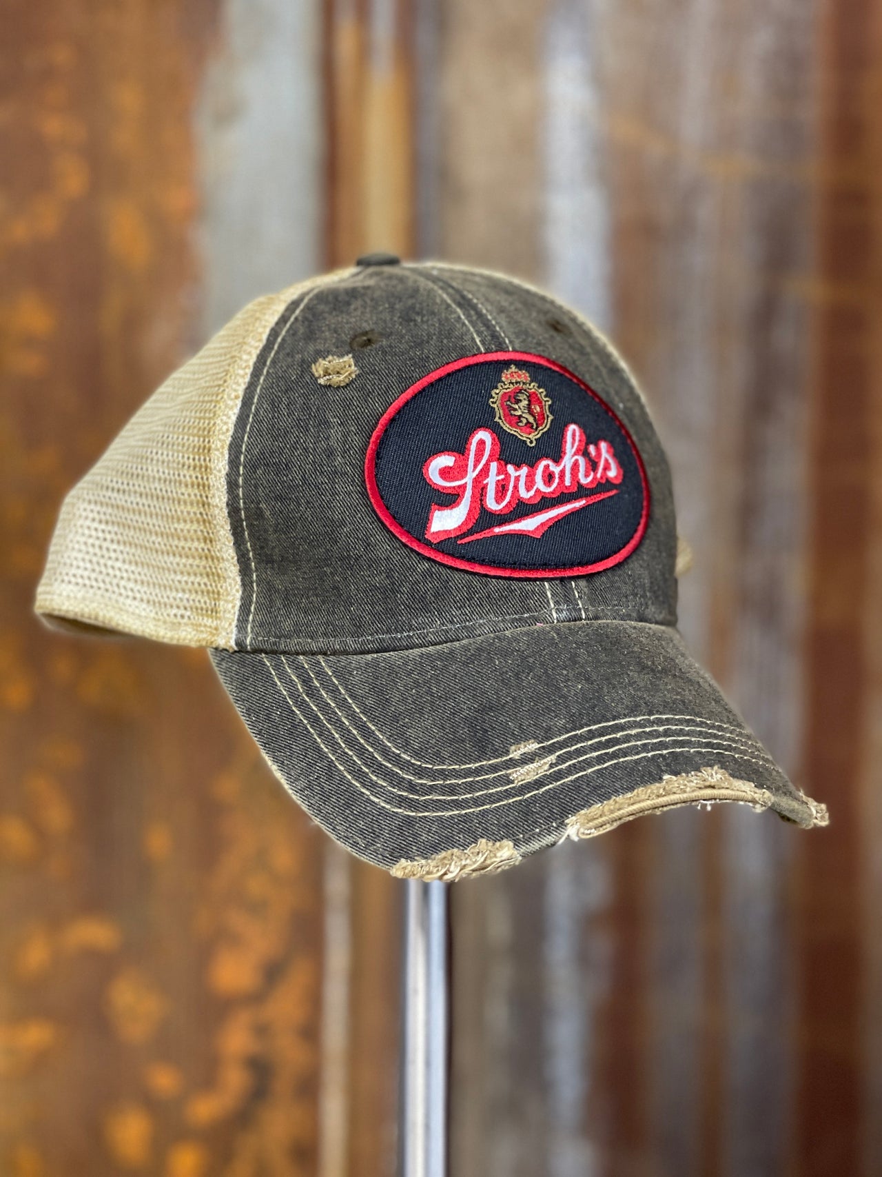
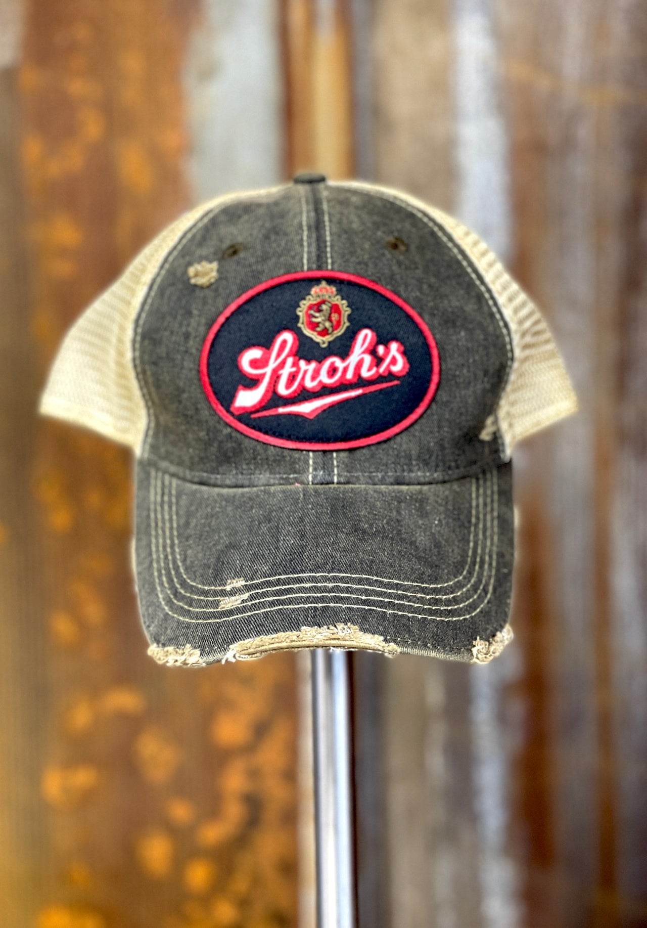
Stroh's Beer Vintage Logo Patch Hat - Distressed Black Snapback
$ 32.00
Stroh's Beer Hat Angry Minnow Vintage
Stroh's Beer Hat Angry Minnow Vintage
Raise a toast to vintage style with the Stroh's Beer Vintage Logo Patch Hat—a distressed black snapback that brings retro brewery charm to your wardrobe. Featuring the classic Stroh's logo, this hat celebrates beer heritage with authentic character. Designed for all-day comfort with a soft, breathable construction and adjustable snapback fit, it's your go-to accessory whether you're hitting the bar, the beach, or just living the good life. The distressed finish gives it that perfectly worn-in vibe that only improves with age. Perfect for collectors, beer enthusiasts, and anyone who appreciates timeless vintage aesthetics.
Stroh's beer Origins
Stroh's beer origins are from Detroit Michigan and at one point was brewed in Minneapolis.
Stroh's Beer Hats are Officially licensed and distributed by Angry Minnow Vintage.
Prepare to hear "Where did you get that!"
Adjustable Snapback, super soft low profile hat.
Fits up to size 7 1/2"


Lone Star Beer Armadillo Logo Hat- Distressed Red
$ 35.00
Lone Star Beer Armadillo Logo Washed Red Hat Snapback
Angry Minnow Vintage Lone Star Beer Distressed Washed Red Ball Cap!
Saddle up with the Lone Star Beer Armadillo Logo Hat—a distressed red snapback that brings Texas pride and vintage brewery culture straight to your wardrobe. Perfect for Lone Star fans, Texas enthusiasts, and anyone who loves authentic regional beer heritage. This hat features the legendary armadillo logo that celebrates Lone Star's iconic status in Texas brewing tradition and Lone Star State spirit. Built from incredibly soft, breathable fabric with an adjustable snapback closure, it delivers comfort that matches its bold personality. The weathered distressed finish captures authentic vintage character and that genuinely worn aesthetic that only classic Texas pieces possess. Whether you're a beer aficionado, a Texas native, or simply passionate about legendary American breweries, this hat lets your love of the Lone Star State and retro beer culture shine through with style. Grab yours and join the proud tradition of Lone Star devotees.
Mens Fashion Caps
Classic snapback design with just the right look for these great iconic Lone Star Beer logo patches! Nostalgia with an updated twist. When it comes to mens fashion caps this lone star red washed distressed hat is at the very top in style!
Lone Star Beer Fashion Apparel
Angry Minnow Apparel for Lone Star beer includes Hoodies,tees, hats and soon flannels.
Adjustable snapback
Fits up to size 7 1/2"


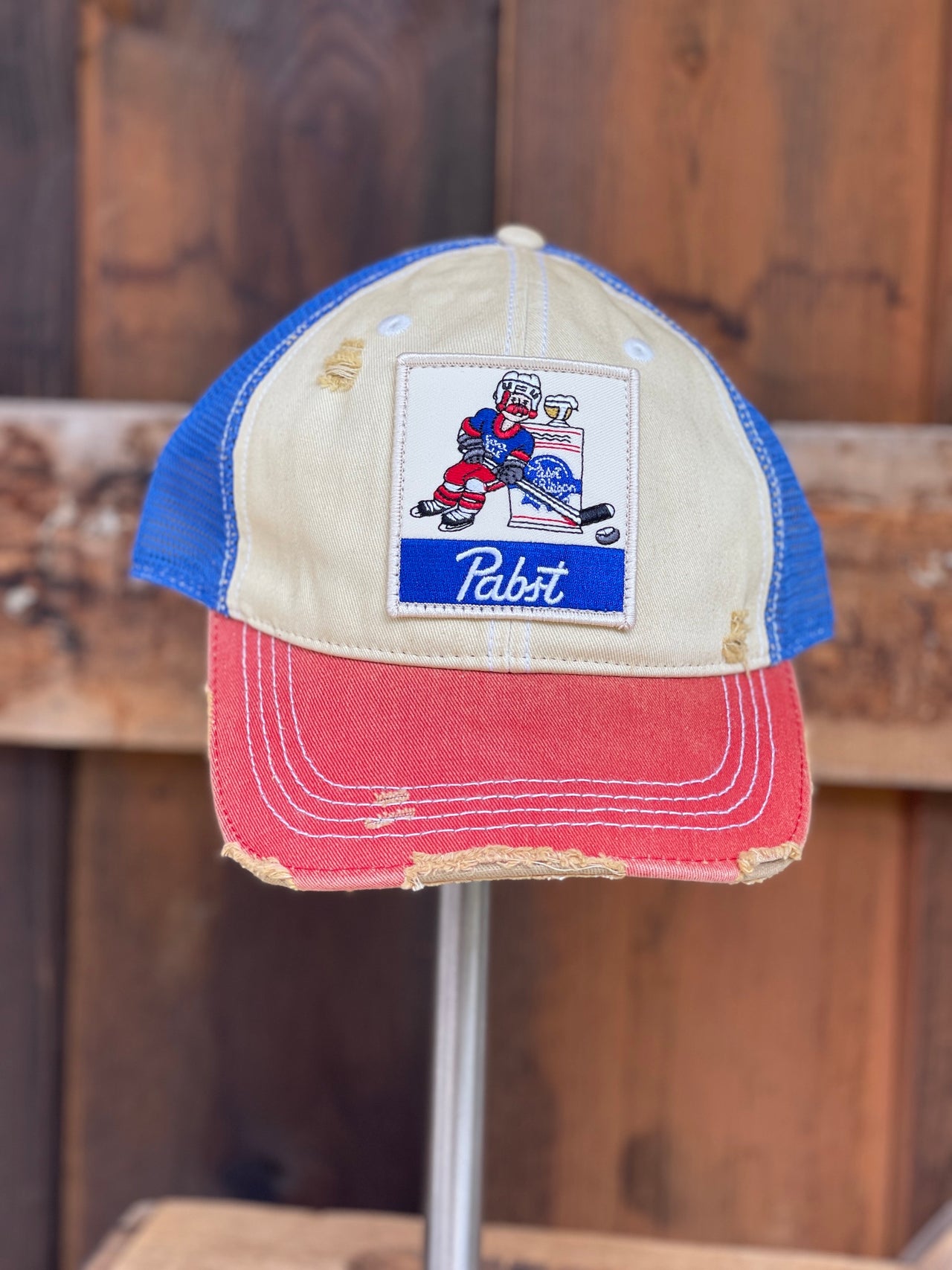
Pabst Blue Ribbon Hockey Hat- Distressed Royal
$ 35.00
Pabst Blue Ribbon Hockey Hat
Score big with this vintage Pabst Blue Ribbon hockey hat in distressed royal blue. Perfect for die-hard PBR fans and hockey enthusiasts alike, this throwback cap brings retro cool to game day or casual wear. The worn-in look gives it authentic character—like it's been cheering from the stands for decades. Whether you're hitting the ice or just want to rep classic American beer culture, this hat delivers vintage vibes with serious style points.
Angry Minnow presents a great Hockey hat for the Retro Hockey Fan! Pabst Blue Ribbon Hockey Hat
Pabst Blue Ribbon Merchandise
Officially Licensed Pabst Blue Ribbon Merchandise from Angry Minnow Clothing Co.
Pabst Retro Baseball Cap
Pabst Retro Baseball Cap snapback in Royal Blue
Adjustable Snapback


Pabst Blue Ribbon Hoodie- Heather Grey
from $ 50.00
Pabst Blue Ribbon Beer Hoodie-Heathered Pabst Blue Ribbon Grey Hoodie
Pabst Blue Ribbon Hoodies are soft, comfortable and are the best fashion hoodies bringing out iconic beers like Pabst Blue Ribbon Beer.
PBR Hoodies
PBR Hoodies from Angry Minnow Vintage feature the Iconic 1844 PBR beer from Milwaukee Wisconsin.
Pabst Blue ribbon hoodies are in! Hot off the press and brand new to the PBR Family/ Angry Minnow Vintage Lineup these super soft comfortable hoodies are sure to turn heads and make you the center of every social gathering.
Pabst Brewing Company Officially Licensed Apparel
Pabst Blue Ribbon Hoodies are Officially licensed and distributed by Angry Minnow Vintage.
Prepare to hear "Where did you get that!"
Mens Sizes S- 2XL
Hats, tees, and flannels sold separately


Olympia Beer Brown Patch Hat - Distressed Brown
$ 35.00
Olympia Beer Retro Hat
Taste the Pacific Northwest with the Olympia Beer Brown Patch Hat—a distressed brown snapback that honors classic regional brewing heritage and vintage beer culture. Perfect for Olympia enthusiasts, beer aficionados, and anyone who loves authentic American brewery tradition. This hat features a striking brown patch design that celebrates Olympia's iconic status in West Coast beer history and timeless brewing legacy. Built from incredibly soft, breathable fabric with an adjustable snapback fit, it keeps you comfortable whether you're at the brewery, the beach, or anywhere adventure calls. The weathered distressed finish delivers genuine vintage character and that authentically aged aesthetic that only comes from true heritage pieces. Whether you're a beer collector, a Pacific Northwest native, or simply passionate about classic American breweries, this hat lets your love of Olympia and retro beer culture shine through. Grab yours and join the tradition of Olympia devotees who appreciate quality and history.
Olympia Beer Vintage Style Clothing
Angry Minnow Vintage snap back distressed cap washed Brown. This one of a kind look brought to you by Angry Minnow Vintage Clothing Co. Olympia Beer Vintage Style Clothing.
Olympia Beer was originally from Olympia Washington and quickly became an iconic brand beer all over North America.
Old Style Beer Minnesota Hat- Distressed Purple Snapback
$ 35.00
Old Style Beer Hat Purple Minnesota
Raise a glass to the North with the Old Style Beer Minnesota Hat—a distressed purple snapback that celebrates classic Midwest brewing heritage and vintage beer culture. Perfect for Old Style fans, Minnesota natives, and anyone who appreciates authentic regional beer tradition. This hat features the iconic Old Style branding that pays homage to generations of quality brewing and timeless Midwestern pride. Made from supremely soft, breathable fabric with an adjustable snapback fit, it keeps you comfortable whether you're at the cabin, the bar, or anywhere in between. The weathered distressed finish delivers genuine vintage character and that perfectly worn-in aesthetic that only comes with time and tradition. Whether you're a beer collector, a Minnesota enthusiast, or simply someone who loves classic American brewery heritage, this hat lets your regional pride and love of retro beer culture shine through. Grab yours and join the community of Old Style devotees.
Old Style Distressed Ball Cap
Old Style Distressed Ball Caps are a great fit, cool style and are sure to turn heads, just read the reviews !
Officially licensed Pabst gear Angry Minnow
Adjustable snapback hat 7.5 average


Stag Beer Hat- Distressed Red
$ 32.00
Stag Beer Hat Distressed Red
These Iconic Beer Patches look amazing on Angry Minnow Vintage hats! This Stag Beer Distressed red Snapback hat look great on anyone who loves beer and hunting!
Stag Beer Apparel
Angry Minnow Vintage offers a full line of super cool throwback stag beer apparel from Hoodies, T-shirts, hats and Sweatshirts.
Super soft distressed red snapback hats


Olympia Beer Ivory Patch Hat - Distressed Ginger Snapback
$ 35.00
Olympia Beer Hat
Olympia Beer hat officially Licensed and incredibly awesome Angry Minnow Vintage Clothing Co.!
Olympia Beer distressed Hat
Angry Minnow Vintage snap back distressed cap in Ginger. This one of a kind look brought to you by Angry Minnow Vintage Clothing Co. Olympia Beer Distressed Hat.
Olympia Beer was originally from Olympia Washington and quickly became an iconic brand beer all over North America.
Super soft low profile snapback hat


Pabst COOL BLUE Hat- Distressed RWB/Tri-tone Snapback
$ 35.00
Pabst COOL BLUE Hat- Distressed Tri-tone Snapback
Stay cool with the Pabst COOL BLUE Hat—a distressed tri-tone snapback that brings retro brewery vibes and vintage beer culture straight to your head. Perfect for Pabst devotees, craft beer enthusiasts, and anyone who loves classic American brewing heritage. This hat showcases the iconic COOL BLUE branding that celebrates Pabst's legendary status in beer history and timeless style. Crafted from incredibly soft, breathable fabric with an adjustable snapback fit, it keeps you comfortable whether you're at the bar, the beach, or anywhere in between. The weathered tri-tone distressed finish delivers authentic character and that coveted lived-in aesthetic that vintage collectors crave. Whether you're a beer aficionado, a retro brand fan, or simply someone who appreciates quality vintage pieces, this hat lets your love of classic Americana shine through. Grab one and join the crew of Pabst fans who refuse to compromise on style.
Angry Minnow Vintage Pabst COOL Blue Hat featuring the icon pabst beer man!
Vintage Pabst Blue Ribbon Hat
Angry Minnow Vintage Pabst Blue Ribbon Hat has the best variety and choices when buying a great retro beer hat
Pabst Blue Ribbon Hats
Pabst Blue Ribbon Hats from Angry Minnow Vintage
Adjustable Snapback Hat fits up to 7 1/2"


Stag Beer Hat- Distressed Brown Snapback
$ 32.00
Stag Beer Distressed Brown
These iconic Stag Beer patches looks amazing on our Angry Minnow Vintage Hats! This Stag Beer Distressed Snapback Hat is sure to be a huge hit with friends and people who remember this American iconic beer.
Stag Beer Hat
Super soft and comfy snapback hat fits like a favorite baseball hat! Adjustable snapback closure. This rustic brown Stag Beer Hat is adjustable to most size heads.
Stag Beer Apparel
Hoodies available too! For this hat and other awesome Stag Beer Apparel check out our Angry Minnow Vintage website!
Officially Licensed products.

Pabst Blue Ribbon Red/ White/ Blue Hockey Hat
$ 32.00
Pabst Blue Ribbon Red/ White/ Blue Hockey Hat
Get ready to hit the ice in style with the Pabst Blue Ribbon Red/White/Blue Hockey Hat. Made with the iconic PBR design, this hat is sure to make a statement. Perfect for any hockey fan, this hat features a stylish red, white, and blue color scheme. Upgrade your game day look with PBR.
An Angry Minnow Clothing Co. exclusive! Pabst Blue Ribbon Hockey Hat
PBR Retro Hat
PBR Retro Hat Pabst Blue Ribbon Beer Retro Hat
Old Beer Merchandise
Old Beer Merchandise Pabst Blue Ribbon officially Licensed Angry Minnow Vintage
Adjustable Snapback Hat fits up to 7 1/2"
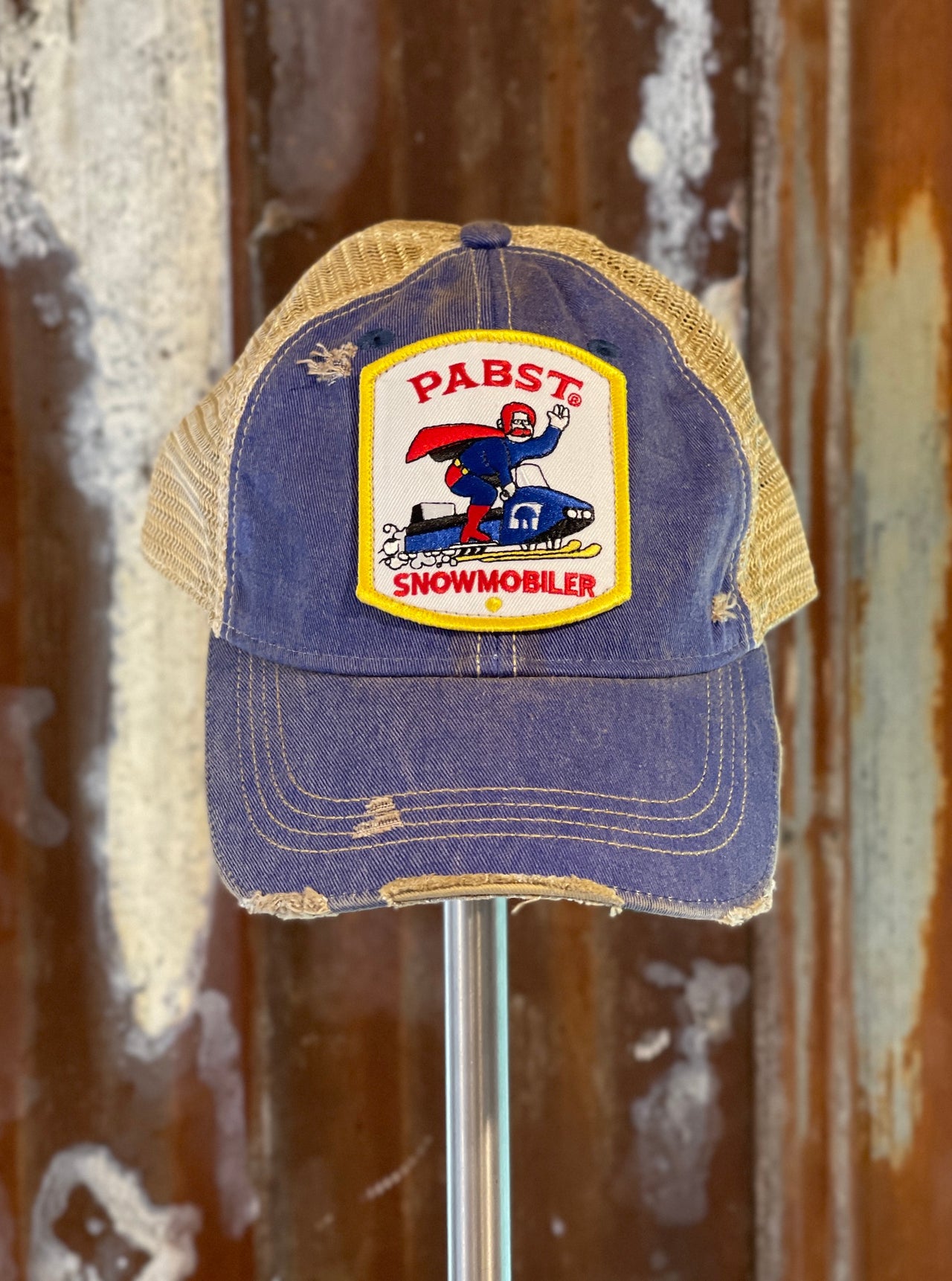
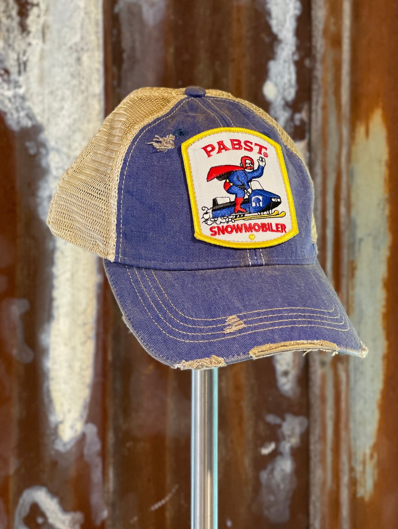
Pabst Retro Snowmobiler Hat- Distressed Royal Blue
$ 35.00
Pabst Beer Baseball Cap
This Pabst Retro Snowmobiler Hat in Distressed Royal Blue is the perfect accessory for your winter adventures. Made with high-quality materials, this hat features the iconic Pabst Beer logo, adding a touch of nostalgia and character to your look. Stay warm and stylish with Pabst.
Pabst Beer Baseball Cap
Baseball Caps for Men
Expertly crafted for cold weather adventures, the Pabst Retro Snowmobiler Hat is a must-have for any outdoor enthusiast. The distressed royal blue design adds a vintage touch while the baseball cap style provides both style and functionality. Stay warm and fashionable with this classic accessory for men.Baseball Caps for Men
Pabst Blue Ribbon Beer Apparel
This vintage-inspired Pabst Retro Snowmobiler Hat is the perfect accessory for any beer lover. Made with distressed royal blue fabric, it features Pabst Blue Ribbon Beer branding for a unique and stylish look. Show off your love for the iconic beer while keeping warm and looking cool. Pabst Blue Ribbon Beer Apparel
Fits up to size 7 3/4"


Pabst BIGFOOT Tee- Heather Grey
from $ 28.00
Pabst Blue Ribbon Bigfoot Graphic Tee
Rock the wild side with this Pabst BIGFOOT tee that blends iconic brewery branding with cryptid mystique. The heather grey fabric offers a soft, comfortable base for the bold graphic that's sure to spark conversations. Perfect for PBR fans, vintage collectors, and anyone who loves a shirt with personality, this piece delivers retro cool with a cheeky twist. Wear it to casual hangouts, festivals, or anywhere you want to show off your quirky taste in tees.
Pabst Blue Ribbon Beer T-shirt
Officially Licensed Pabst Apparel by Angry Minnow Clothing Co.! Pabst Bigfoot on our comfy Cotton/ Poly blend tees. Pabst Blue Ribbon Beer T-Shirt
Graphic Tee Bigfoot Pabst Blue Ribbon
Angry Minnow Graphic Tee Bigfoot Pabst Blue Ribbon
Mens sizing M-3XL


Schmidt Beer Snowmobile Tee- Heather Grey
from $ 28.00
Schmidt Beer Snowmobile Tee
An iconic image on a super soft shirt, win win! Schmidt Beer Snowmobile Tee
Mens sizing S-3XL
Tees, hats and hoodies sold separately